Did you know that in today’s fast-paced digital world, the average attention span of an internet user is just a few seconds? With such a small window to capture their interest, it has become increasingly crucial for businesses to make a powerful first impression online. So, ask yourself: Is your website optimized to engage and convert visitors across various devices? If not, it’s time to explore the importance of responsive web design for your business.
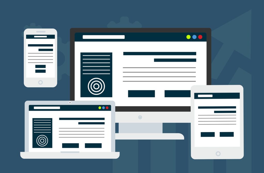
Responsive web design has emerged as a game-changer in the realm of website development. It enables your website to adapt seamlessly to different screen sizes, creating a consistent and user-friendly experience on desktops, laptops, tablets, and smartphones.
This guide will delve into the world of responsive web design and uncover why it is an indispensable tool for your online success.
Understanding Responsive Web Design:
Instead of creating separate versions of a website for desktop and mobile, responsive design ensures that a single website can provide an optimal viewing experience across a wide range of devices.
The key principle behind responsive web design is fluidity. Whether a user is viewing your website on a large desktop monitor or a small smartphone screen, responsive design ensures that the content remains visually appealing and functional.
One of the primary goals of responsive web design is to eliminate the need for users to zoom in, pinch, or scroll horizontally to access content. Instead, the website’s layout intelligently presents an optimized version that fits the screen perfectly. This approach not only enhances usability but also saves users time and effort, leading to improved engagement and higher chances of conversions. It ensures a consistent user experience, eliminates the need for multiple website versions, and optimizes usability across various platforms.
How Does Responsive Web Design Work?
Responsive web design uses smart techniques to make websites adapt and look great on various devices. Here’s a breakdown of how it works:
Flexible Layout: Responsive design uses a flexible layout that adjusts automatically based on the size of the screen.
Proportional Sizing: Elements on the website, such as images and text, are set to grow or shrink proportionally to fit the screen size. This ensures that the website looks balanced and readable on different devices.
Media Queries: Media queries check the device’s screen size and apply specific styles to make the website look good on that particular device. It might adjust things like font sizes, spacing, or the placement of elements to ensure a pleasing appearance.
Mobile-Friendly Navigation: Responsive design takes into account that mobile users interact with touch screens. It ensures that navigation menus and buttons are large enough and spaced appropriately, making it easy for users to tap and navigate the website on their smartphones.
Adaptive Images: To optimize loading times and appearance, responsive design adapts images. It automatically resizes and compresses images based on the device, delivering a high-quality image that fits the screen without slowing down the website.
Importance of Responsive Web Design:
Having a non-responsive website may result in driving away the enormous user base of those who prefer browsing the internet on their smartphones. This could lead to a loss of revenue and hinder your ability to compete effectively.
It’s important to note that responsive design is now a key factor in achieving higher rankings on search engine results pages. Let’s explore a few more reasons that highlight the significance of responsive web design for your business:
- Enhanced User Experience
User experience (UX) plays a pivotal role in determining the success of a website. Responsive web design ensures that your website is user-friendly. This seamless experience helps to keep visitors engaged, encourages longer browsing sessions, and improves the chances of conversions. It helps in:
- Easy Navigation
- Consistent Branding
- Improved Readability
- Faster Loading Times
- Enhanced Mobile Interactions
- Reduced User Frustration
- Improved Mobile Traffic and Conversions
Search engines like Google prioritize mobile-friendly websites in their search results. By adopting responsive web design, you increase your chances of ranking higher in mobile search rankings, which can significantly boost your organic mobile traffic.
A responsive design also enhances user engagement on mobile devices. When visitors have a positive experience on your website, they are more likely to stay longer, explore more pages, and engage with your content. This increased engagement not only helps build trust and credibility but also increases the likelihood of converting visitors into leads or customers.
By prioritizing responsive web design, you can capture the attention of mobile users, improve their browsing experience, and ultimately drive more conversions for your business.
- Cost-Effective Solution
In the past, businesses often created separate mobile versions of their websites to cater to mobile users. However, managing multiple websites can be complex and costly. Incorporating responsiveness into the initial design phase of your website can be more cost-effective than retrofitting an existing site for mobile compatibility later on.
This saves unnecessary costing of:
- Reaching Wider Audience
- Development and Maintenance Costs
- Redesign Expenses
- Adapting to Future Technologies
This streamlined approach of responsive web design saves time and resources, enabling you to focus on other aspects of your business while providing a consistent experience to all users.
- SEO Benefits
Search engine optimization is essential for improving your website’s visibility and driving organic traffic. By having a responsive design, your website becomes more likely to appear in relevant searches, increasing its visibility and attracting potential customers.\
When it comes to SEO (Search Engine Optimization), responsive web design offers several benefits that can positively impact your website’s visibility and rankings on search engine results pages (SERPs).
Improved Mobile User Experience: With the increasing number of users accessing the internet through mobile devices, search engines like Google prioritize mobile-friendly websites.
Consolidated URL Structure: Responsive design maintains a consistent URL structure across all devices, unlike having separate mobile and desktop versions of your website.
Mobile-First Indexing: Search engines have transitioned to mobile-first indexing, where the mobile version of a website is given priority in indexing and ranking.
Lower Bounce Rates: A responsive design contributes to a lower bounce rate by providing a consistent and engaging user experience across devices.
Social Sharing and Link Building: Responsive web design simplifies the process of sharing and linking to your content. When users share your website’s URL, it will automatically adapt and display properly on any device.
- Enhanced Analytics and Tracking:
Managing a single responsive website simplifies your analytics and tracking processes. This consolidated data provides a comprehensive view of your website’s performance and user interactions, helping you make informed decisions and optimize your online presence.
You can easily track user behavior, monitor conversions, and gather valuable data from a unified source. Here’s how:
Comprehensive Data Collection: With a responsive website, you have a unified source of data for all devices. This means you can collect comprehensive data on user behavior, interactions, and conversions from a single analytics platform.
Cross-Device User Journey Tracking: Responsive design allows you to track the user journey seamlessly across different devices. You can gain insights into how users interact with your website, where they enter, exit, or convert, and how they navigate through different pages and sections.
Device-Specific Performance Analysis: Analytics data can provide device-specific insights into user engagement, bounce rates, conversions, and other key metrics. This information helps you identify specific device-related issues or opportunities for improvement.
Customized Reporting and Insights: You can generate custom reports and dashboards that focus on specific devices, user segments, or conversion goals. This level of customization allows you to monitor key performance indicators (KPIs) and metrics that are most relevant to your business objectives.
- Brand Consistency and Trust
A responsive design ensures consistent branding across different devices. Regardless of the screen size, your website’s layout, image, and content will remain consistent, reinforcing your brand identity and instilling trust in your audience. Consistency in design and messaging strengthens your brand’s reputation and encourages users to engage with your business.
By ensuring that your branding elements and user experience remain consistent across devices, a responsive website creates a seamless and professional impression. This consistency fosters trust, enhances credibility, and encourages positive user feedback and referrals. With this, you can strengthen your brand’s presence and establishes a trustworthy image in the eyes of your audience.
- Competitive Advantage
Having a responsive website is no longer just a preference; it’s becoming an industry standard. By embracing responsive design, you stay ahead of the competition and cater to the growing number of mobile users.
A mobile-friendly website not only attracts and retains more visitors but also positions your business as modern, reliable, and customer-centric. By providing a seamless and user-friendly experience across devices, you can differentiate yourself from competitors and capture the attention of potential customers.
Additionally, responsive design boosts your search engine rankings, as search engines prioritize mobile-friendly websites. This increased visibility and accessibility contribute to a stronger online presence, attracting more visitors and ultimately driving business growth. Stay ahead of the competition by embracing responsive web design and capitalizing on its benefits for your business.
Go Responsive:
The Bottom Line is that Responsive Web design is not just a trend; it is a necessity in today’s digital era. From reaching a wider audience and delivering an exceptional user experience to gaining a competitive edge and optimizing your online presence, the benefits are immense. As technology continues to advance and user behaviors evolve, responsive design ensures that your website remains adaptable and future-proof.
So, don’t get left behind in the race for online success. Invest in responsive web design and pave the way for a brighter future where you can captivate, engage, and thrive in the ever-changing digital realm.